8.2.10

Anish Kapoor: Memory


A recent jaunt to New York City lead me to the Guggenheim, which although has a tremendous lineage of being one of the great visual scapes of the arts in North America, can be underwhelming with it mass of viral tourists. While Wassily Kandinsky was the artist that hugged the white helix, most fittingly recessed in the Guggenheim was Anish Kapoor’s work “memory”. The contradistinction between these two artists was presented itself in(as a) a contemplative tension between taunt lines & vacuums of color that depict images that seem to allow composition to abscond—verging on the visceral and the latter(also as) an ode to collapsing space.

To see such a voluminous body of Kandinsky’s work gives one the obvious ability to contrive some form of trajectory or providence. But, I shunted the notion. It seemed more apt to look for conclusions about his perception, how his meta-aesthetic collided with Kapoor’s. While, I have no perception(I can only imagine) of how the artists would respond to an individual reflecting upon their work as a dialectic constructing space, it seems to be the most appropriate modus operandi to assimilate the Guggenheim that evening. As I stepped out into the streets I was acutely aware that, a response to their work would have to divulge into the notion of the construction of space—how we demarcate it.

Kapoor notion of spatial construction is part of a concept that art is about the investigation of how we associate to space and things in them, “art objects have a thingness in themselves, which precipitate some form of a priori judgment” (judgment before thought—recognition of phenomena in our surrounding). Kapoor’s consciousness of artistic creation is tandem to Martin Heidegger’s notion of thingness. Heidegger conceived of thingness as something that codifies our association to the world as occurring from the encounter of things that exist in itself, a thing exists as its own, without adding value from the viewer in the case of art. To be a thing, it must have its own presence—an essence that delineates space. Memory exists as a thing, not as something that requires us to dabble into the construction of art, but rather in the art thing itself.

Please note: the first image of Memory is a view literally inside the piece, carved through the gallery wall.

30.1.10

Endless Nile


Last Summer I had the privilege to sit down with Amr Helmy, the principle designer for Amr Helmy Designs. While this Design institution is based in Cairo, it on the cusp of creating a global impact for design. His approach is multifaceted focus to design. He has put in place a design academy to cultivate the Egyptian design community and had been a continuous advocate of creating Egyptian design that is both equitable in the local and global design economy. Helmy has created a design firm that not only sees design as product, but the production all components of design, education, production, and creating awareness of how design influences ones life.

During our discussion I had the chance to view and experience one of his recent projects The Endless Nile Table. This piece, conceived by Karim Rashid and put into production by Amr Helmy Designs, illustrates not only the impact Egyptian of design, but also how it can reinterpret the historically relevant geography. The table comes into formulations a single undulating piece of white corian or pine slats. The white corian gives the table an ethereal appearance and feel, while the wood allows it seem as if it has turned the Nile river into a flow of wood, with grains of history touching the banks. What makes this piece command so much attention is how it leads the subconscious; it requires the viewer to mentally feel the contours of the table, interpret how they come to associate to its space. As one approaches the table and begins to place himself within the piece, one becomes consumed with the sensual curves (which is an aesthetic feat, corian is oftentimes a banal material with little use outside of countertops). Helmy explicated that this piece was brought into production through a desire to create something that was representative of both the quality of craftsmanship that is growing in Egypt, but also something uniquely reflective of history.

20.1.10

The Fox: Thomas Pink


Thomas Pink is a smart young company, it was conceived by three irish brothers in the 1980's. These gentleman quickly established themselves as a classic bespoke shirtmakers in London, owning and operating a emporium on the legendary Jerymn Street. While Saville Row is the locus for a mens suits, Jermyn Street is the quintessential location for shirt makers in London. Pink is no longer owned by the three brothers, but is still an exemplar of a classic shirtmaker. The first shirts where tailored using 38 separate pieces accompanied with 14 piece hand turned collar, which can still be purchased under the personally PINK moniker. Here is a peak at my PINK.

19.1.10

More Affects


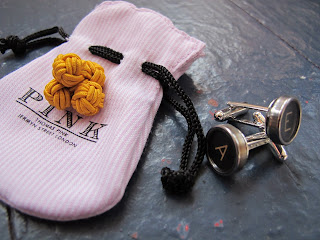
Affects are essential to a complete wardrobe, here are some more affects that I had purchased while in New York City. Thomas Pink silk ball cufflinks in mustard yellow (which compliments the Thomas Pink grey gingham shirt) and typewriter cufflinks from the Brooklyn flea market, held in the historic Williamsburg Savings Bank.

Affects of Heritage


Cultivating personal taste is an ethereal expression. Many shops and designers are trying to replicate the ad hoc nature of individuals wardrobes in their stores. One such example is the Liquor Store, owned by J.Crew. Much of the space is the vestiges of the previous occupant, an elegant dark wooden bar and shelves that still have bottles(which one is suppose to think remained from the previous occupant). Liquor Store and similar boutiques are furnished to styles more than brand and in this case the Liquor Store's dernier cri is about heritage fashion: Alden wingtips, Fidora's and, anything else that resurrects the memories of Hemingway. On my recent jaunt to New York I visited the the Liquor Store in search of heritage couture affects. I had a particular piece in mind, a tie clip with a tailor's shear motif. To my surprise the store manager Bret, after i had inquired about tie clips, reaches behind the bar and proceeds to open a manila envelope and pour a dozen vintage tie clips on the bar. It was a prime example of why brands such as J.Crew are beginning to open such boutiques, they are able to establish themselves as a nexus of style rather than a brand.

13.1.10

Drawn by Mark "the wandering guy"


As a Washingtonian that traverses the many cultural centers, I have had several encounters with Mark. Mark is a self professed wanderer, extremely well educated and can hold a heavy dark conversation well beyond the normally acceptable social limits. Mark is an unforgettable character of DC. He is unkept, but well dressed, and carries the New York Times as if he is a refugee from Manhattan, which is kinda fitting because most persons are predisposed to think of Mark as part of America’s underbelly of mentally ill.

Seeing this image of a bunny rabbit and crude phallic imagery seems like a strange introspection, it begs the viewer to add meaning and question the makers motives. further adding to the intensity of the image is the vibrating parenthesis that surround the phallic thing. invariably we all desire some form of vibration and innocence, Mark merely exposes himself as such.

James Dean: American Dreamer

One of my favorite pieces in the The Digest in the past few years, it is an exceptional exposition of someone who so many of us know of, but do not fully understand. James Dean strikes as an authentic American, with the likes of Peck, Brando, & Kerouac (just to name a few). All of those individuals prefaced their exterior world with a nuisance that forced America to reconsider itself. This was pulled from the October issue in 2008.